REPAIRSOLUTIONS2 MOBILE APP · Design SYSTEM
Building a scalable design system in Figma.
How I craft dev-ready components that ensure consistency across the entire experience.
ROLE
Lead UX Designer
TIMELINE
3 months
TEAM
Design · Eng
SCOPE
Principles → Development
Heirarchy
Architecture
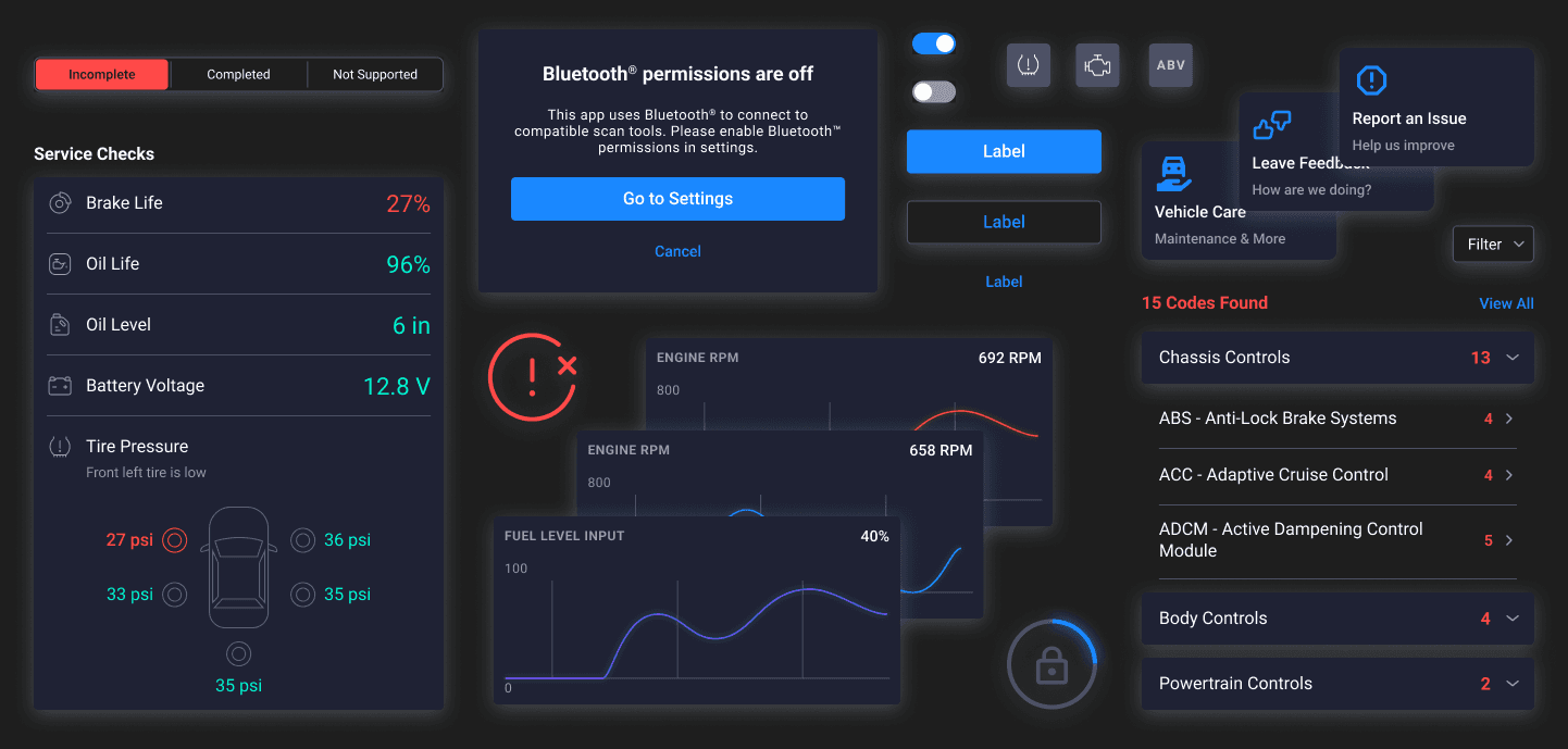
Rules for how and when to use header & footer variations, modals and action sheets ensures a consistent interaction and intuitive navigation.

Layering


Tokens
Brand Guidelines
The brand guidelines had not been formally defined, so I began by working with the business team and designers to document them.

Palettes

Color Mode Boolean
All components could be toggled from Dark to Light mode, expediting design and development efforts.

Component Design
Atomic Design Principles
Nesting elements kept the entire system clean and organized, making it easy for designers and developers to build screens.

Adaptive Resizing

Annotations
Helping developers understand the intended display behavior for the source data.

Variants

Interactions
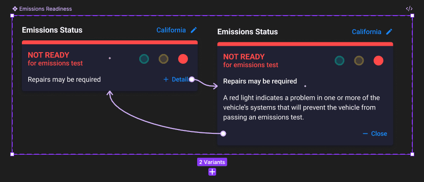
Defining interactions make mock-ups quicker and defines the desired interaction properties for developers.

Accessibility

What I learned
How to Reduce Bloat
Nesting components, utilizing booleans and text variables makes updating instances faster and easier by reducing manual adjustments.
Collaborate with Developers
How to prepare components for development by utilizing annotations, tokens and defining interactions.
Thanks for your time
“How we spend our days is, of course, how we spend our lives.”
— Annie Dillard
Back to top